Golden Gate Valley Branch Library in 2011 Early photo of the library
Renovating historic buildings is a lot like solving a puzzle. You want to keep as much of the historic integrity as possible, but you also want to make it work for contemporary uses.
Striking this balance was a big part of the recently completed renovation of the Golden Gate Valley Branch Library in San Francisco. The project is the recipient of a 2012 AIA SF Honor Award for Historic Preservation and is one of roughly 100 libraries nationwide to be featured in the American Library Association’s 2012 Design Showcase. We worked in collaboration with Paulett Taggart Architects on this Carnegie library, originally designed by Ernest Coxhead, and completed in 1918. It’s a beautiful terra cotta Beaux-Arts structure in the shape of a basilica, and has been loved by its neighbors for generations. Because we were following the Secretary of the Interior’s Standards for Rehabilitation & Guidelines for Rehabilitating Historic Buildings, any contemporary modifications we made had to be clearly of this era and not mimic the original design.
The biggest challenge was making the library accessible for people with disabilities in a way that maintained the historic integrity. We could have added a ramp to the main entrance at the front of the building, but the change in level between the sidewalk and main floor was just over five feet. To handle a grade change of that size, the ramp would have dominated the historic front façade due to its length.

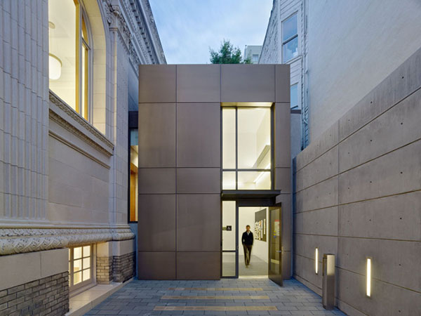
Instead, the team created a new entry with an elevator placed strategically in the existing courtyard. Until then, the courtyard had served essentially as a stroller parking lot for children’s programs and as a secondary exit from the lower level. Just barely visible from the street, the new elevator entry is an aluminum-clad box that clearly reads as contemporary yet complements the historic architecture. At the intersection of the new addition and the existing building, we strived to leave many of the terra cotta pieces exposed, including a fluted column, as evidence of the original exterior. To further reveal the original facade, a slot of glass separates and highlights the transition from new to old.
One goal was to make the building as green as possible, but the building’s historic significance took precedence. For example, we decided to pursue certification under LEED for Commercial Interiors instead of LEED for New Construction and Major Renovations, because the latter would have required us to replace all the historic windows with new high-efficiency ones.
We did, however, replace five windows at the rear, south facade to reduce solar heat gain, restore natural ventilation, and improve waterproofing details. On the other three sides of the building, we restored and cleaned up nine historic windows to maintain their integrity and restore natural ventilation. Though we didn’t receive “credit” for salvaging these windows, saving these resources and others throughout the building is an invaluable green strategy, given the embodied energy and cultural impacts of the existing building. The project is designed to achieve at least Silver LEED-CI certification, and perhaps Gold, pending final review by the US Green Building Council.
Other green interventions include solar panels, which provide about 25 percent of the building’s power, and new low-flow plumbing fixtures. New high-efficiency mechanical systems and upgrades to the existing radiant system further reduce the building’s energy and water consumption. Though these upgrades are modern additions, they do not affect the historic character, because the solar panels are hidden from view on the roof and the new radiators are concealed behind the historic grills in the main reading room.

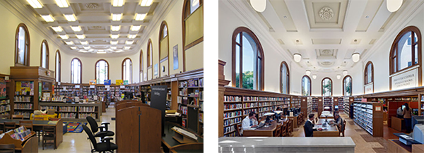
Main Reading Room (Before) Main Reading Room (After)
The interior lighting also provided a great opportunity to improve the building’s energy efficiency, restore the historic character at the ceiling of the main reading room, and enliven the existing spaces with improved lighting. The reading room on the main level had harsh fluorescents surface-mounted over the coffered ceiling, and they drew attention away from the historic character of the ceiling. We hung new pendants for ambient lighting and then, along the perimeter above the wood casework, we introduced a metal valance concealing a strip fluorescent that washes the walls with light.
New paint better reflects the light and highlights the ceiling details. Thin fluorescent light strips on the stack shelving help to illuminate the books. Since the reading room is surrounded by large windows that let in a lot of natural light, daylight sensors dim the light fixtures as needed to reduce the building’s energy use.

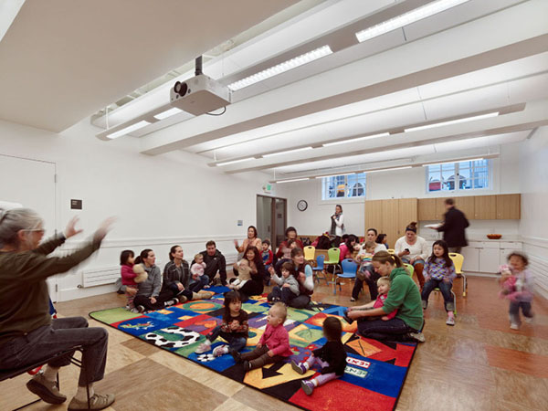
For the program room, we introduced new, better lighting and new paint to enliven the space. Previously the room was dark and didn’t quite feel appropriate for the energetic children’s programs. We added a sink and more storage space to support the needs of the children’s programs and community uses. Also on the lower level, new ADA accessible bathrooms were added to benefit all of the library’s users, and excavation work was performed to make the entire basement one, accessible level.
Some of the biggest changes we made were to the staff office spaces, making them much more functional than before. Previously, the staff workroom was a very tight space, with barely enough room for the sorting station and the bins of books arriving from other branches. We removed the existing stair in the middle of the existing support area and added a new one at the new courtyard entry. That freed up space to open up the workroom and add an office for the branch manager. A skylight and a light well provide daylight to the staff work room and break room below in the lower level.
For the most part, our interventions to the public portions were minimal. We even were able to salvage, clean, and reuse the original 1918 chairs, including some that had wandered off to other branches over the years.