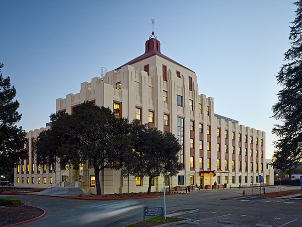
Exterior of Hoover Pavilion, completed in December 2012
When Stanford University Medical Center asked us to renovate the Hoover Pavilion, we were aware that this was a building loaded with history. That was part of the challenge: how do you fit next generation medical services into a 1930s structure made for a very different model of care delivery?
The obvious part of the history is the building’s iconic value for a generation of locals who were born there in the 1940s and 1950s, back when it was Palo Alto Hospital. In fact, we heard from some of these locals: they told us, “I was born in that building. Don’t screw it up.”
But the building also represents another, older piece of history: the pavilion principle, from which its design is derived. Popularized by Florence Nightingale in her Notes on Hospitals in the mid-19th century, the pavilion principle replaced the old hub-and-spoke model of hospital planning, which put patients along the spokes radiating out from the nurse’s station at the hub.
Nightingale and others of her era recognized that many more patients were dying of infection than of actual wounds. Their mantra: control the infection. One of the first hospitals built under her model, St Thomas’ Hospital in London, illustrates the principle: it was organized into separate ward buildings, with each nurse staying with her ward, limiting the possibility for contagion. This was a huge jump forward and saved many lives.
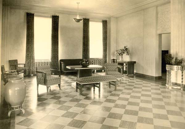
Palo Alto Hospital Lobby, 1931; photo courtesy of Stanford Medical History Center
So Palo Alto Hospital’s design represented a revolution in healthcare at the time—but time had marched on. When Stanford University bought the hospital in 1968, it converted it to medical offices. Flash forward 45 years, and the uncomfortable fit was all too apparent. Built in two phases, the Art Deco building was beautiful, but had an inflexible concrete structure, with unusually low floor-to-floor heights and a row of columns marching down the center of the floor plate. Access was through an 8' wide (appropriate for a hospital) double-loaded corridor that ran down the middle, which chopped up the already-narrow floor plates. And the interiors were dimly lit. None of these aspects made it suitable for modern medical care delivery that Stanford is known for.
On top of all that, the construction is quirky: built during the Great Depression, when labor was cheap and concrete and steel were not, it has many irregularities: floor-to-floor heights vary, windowsill heights vary, column bays are non-standard. That made it difficult to create a standard layout and common set of details.
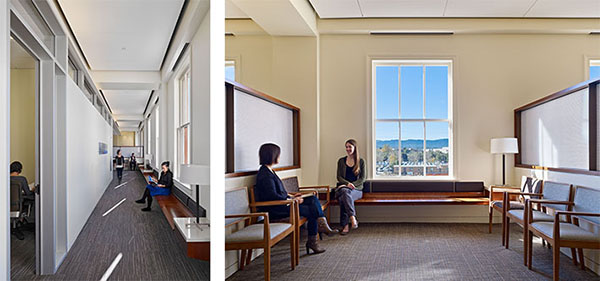
Public circulation (left); waiting area (right)
To create a workable modern office building layout, we eliminated the central corridor and re-routed the public circulation to the perimeter of the floor plate. This not only had the effect of doubling the width of space available for clinics, making the layout and circulation much more efficient and compact, but also allowed the public areas to take advantage of the natural light that streams through triple-height windows. In a historic building, this change was only possible because the original interior had long ago been demolished during earlier renovations, so changes could be made while complying with the Secretary of Interior’s standards for historic preservation.
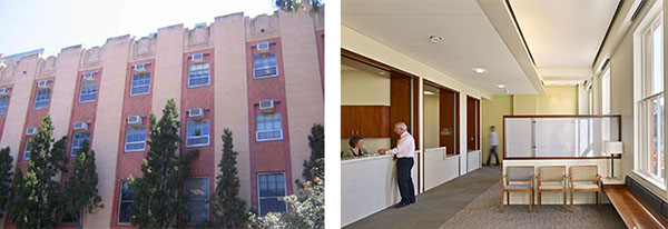
Previous air conditioning units (left); Drop ceiling in second floor waiting area (right)
Previously, the building’s rooms had been fitted with ungainly air conditioners sticking out of the windows. We took those away and tucked a new mechanical system under drop ceilings at the center of the floor plates. That allowed the ceilings to be at their highest along the edges, where the examination rooms and circulation areas are—the places people spend the most time.
It was still a squeeze. To fit into the floor plates, we modified the standard modern clinic module, which usually places the waiting area, check-in area, diagnostic and treatment rooms, and physician offices in a linear sequence. We couldn’t skimp on the diagnostic and treatment portion, so we consolidated the offices into neighborhoods and shrank the waiting area as much as possible.
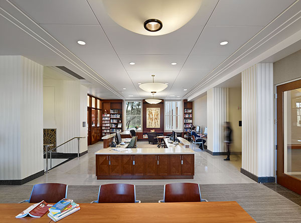
Health Family Resource Center
This was made easier by Stanford’s sophisticated patient scheduling system, which results in shorter wait times. Rather than have many patients come in all at once and wait to see their care providers, Stanford schedules smaller numbers of patients at a time and spaces appointments out in real-time increments. That’s good for patients, who don’t have to wait very long. To provide additional waiting spaces, we placed benches in the hallways, and people can also wait in the café, the library, or the lobby.
Bringing historic medical buildings into the present isn’t easy, but in many cases the importance of preserving the past outweighs the challenges. The many people who were born here can walk by and still see the incredible Art Deco exterior, now restored, with its distinctive ziggurat massing and its iron finial replicated and returned to the top of the highest tower. Patients will find thoroughly modern medical care inside, with new interior details that reference the ornamentation on the outside. It’s designed with enough flexibility that it should be able to meet the needs of different clinician groups for at least 50 more years—long enough, we hope, for the next healthcare revolution to arrive.
Contemporary Photographs ©2013 Bruce Damonte