We’ve been asked to design everything from an equestrian center to pump stations to a nuclear medicine suite, but perhaps the most unusual assignment we’ve ever been given is to design a wall. Not just any wall, but a freestanding one—ten feet high and nearly a mile long. It posed a fascinating challenge.
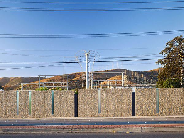
PG&E asked us to put this wall around its Martin Substation, which acts as a conduit for 70 percent of San Francisco’s power. It straddles the border of Daly City and Brisbane, at the corner of Bayshore Road and Geneva Avenue. To keep it secure, the substation had long been surrounded by a chain link fence topped with barbed wire: not very attractive.
The site is surrounded by some housing, a few motels, a gas station, and open landscape. So how do you make something that gives the required security (and resists graffiti), but that doesn’t feel like a fortress? The risk with such a huge wall is that it could seem to shut out the world with a blank, deadening expanse of masonry. After all, it had to be 4,320 feet long.

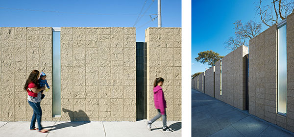
We decided the wall should have a visual relationship to the long, low hills beyond. We chose two kinds of masonry block. For the wall’s exterior, we used split-face blocks, which have a lot of texture that catches the light in interesting ways. The yellow masonry blends in well with the distant hills, especially in the summer. For the wall’s interior, we used smooth-faced blocks to save costs.

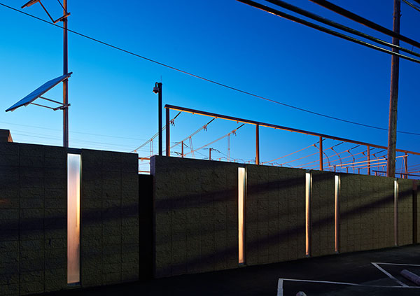
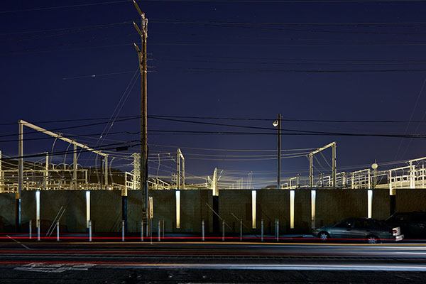
Then, because the ground slopes as it approaches Bayshore, we broke up the wall into segments that step down to follow the grade change. Between each segment, we inserted one of two kinds of infill panel to demarcate the change in level and add further variety. The first type of infill panel, which is a foot shorter than the wall, consists of concrete masonry units on the inside and Heath tiles set in soldier course on the outside. The second type of infill panel consists of channel glass, which lets light through during the day; at night, they are back-lit for dramatic effect.

Illumination comes from custom LED strips powered by five onsite photovoltaic arrays. Because the wall segments are different lengths, and the two types of infill panels alternate in an irregular fashion, they create an eccentric syncopated rhythm, avoiding a monolithic feel. And of course, everything has a special coating so that any graffiti can be easily cleaned off.

Usually we’re designing buildings that relate to the street rather than serve as a barrier. A security wall may sound like the most utilitarian piece of architecture, but the opportunity is there to create something that is sculptural and that relates to its surroundings. We get a charge out of that.
Photos ©2012 Bruce Damonte