A couple of years ago, we wrote about our experience renovating the historic Hoover Pavilion at Stanford and the challenge of adapting a 1930s hospital into a 21st-century medical office building. Just as we were finishing up our work on that project, Stanford Health Care (SHC) invited us to propose on another piece of the overall Hoover Medical Campus project. This time, we would be designing a brand-new building. Much easier, right? But sometimes even a new building turns out to pose intriguing constraints.
Stanford had already received entitlements from the city of Palo Alto for a medical office building as part of the overall medical campus modernization. Its use at the time was undetermined. Soon after entitlements were granted, it became clear that there was a need to bring several SHC neuroscience departments together under one roof, combining researchers and practitioners for maximum integration and collaboration. This generic medical office building quickly needed to become specific.
First hitch: the building was too small to accommodate the departments’ needs. But it had already been entitled, so the building envelope could not change significantly. We figured out how it could be enlarged by 10 percent by moving it closer to the street while keeping it as distant as possible from the existing Hoover Pavilion, preserving and reinforcing the Pavilion’s relationship to the street. Voila—90,000 square feet became 100,000.

Another challenge was to make the generic entitled design much more site-specific. We wanted to explore the limits of SHC’s usual palette of materials and respond to the strong material cues offered by Hoover Pavilion, an off-white concrete building with strong red terracotta accents. We considered employing red terracotta tile accents on the neuroscience center exterior, but it was too much of the same thing, so we created accents in a modern vernacular, not terracotta but a deep metallic red behind glass.
Another challenge was that Hoover Pavilion was only about 60 feet away, and all its historic wood windows were single-glazed—not very good at blocking sound. So we talked with our structural engineer, who recommended a system called ConX, a modular prefab structural steel framing system developed by the Bay Area company ConXtech. It’s a system of beams and columns that are bolted together, a process that eliminates the noise and mess of welding. Plus, the erection process takes a quarter of the time that a conventional steel structure would. Instead of three to four months, our contractors finished steel erection in three weeks. Even better, it cost about $200,000 less than conventional construction.
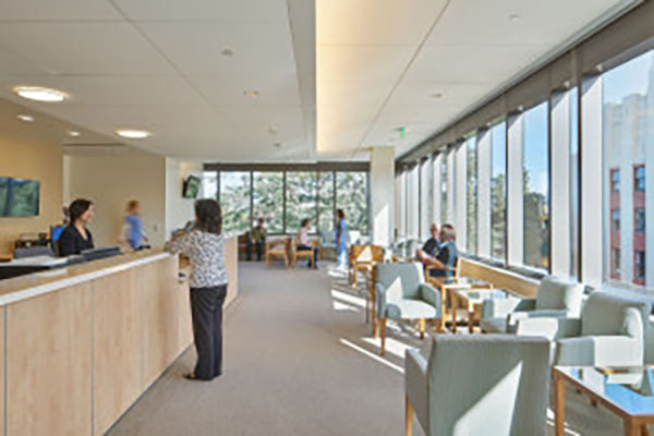
The interior finishes needed to reflect the high quality of the SHC brand without costing the earth. Lighting became really important. Bad lighting can make expensive materials look cheap, and good lighting can make inexpensive ones look great. Lighting was also crucial to highlighting the art on display in the building.
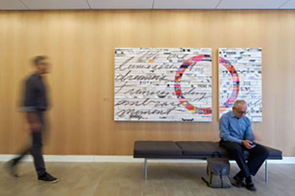
We worked to maximize ceiling heights and bring in lots of daylight wherever we could. Because a number of neurology patients are highly sensitive to light, we advocated for the use of LEDs in most places. An average person does not perceive the flicker of most modern fluorescent lights, but people prone to migraine headaches are much more sensitive.
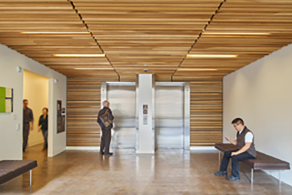
Stanford Health Care’s interior and exterior material and color palettes reference the California landscape. To emphasize nature, we incorporated as much wood as we could. Because it’s expensive, we used it judiciously, only in the public spaces wrapping the main core and above the elevator lobby.
We weren’t the only ones who had to respond creatively to constraints. Toward the end of design, the hospital leadership initiated lean practices for all new projects in order to eliminate inefficiencies and waste. This had huge implications for the interior design.
SHC has about 21 subspecialties within neuroscience in different locations at the moment, and they would all be coming together in the new building. To carry out the lean practices, representatives of each department met in Redwood City and spent three days working on the building layout to make staff workflows more efficient and improve the ways patients experience the building. We gave the 3P team a plan of the things that could and couldn’t change because of where we were in design.
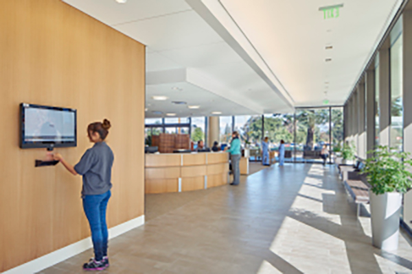
They rose to the challenge. For example, for the first-floor centralized reception and check-in area, the team mocked up different reception desks at different heights and in different shapes to figure out what would work best for the patient population. They wanted to make the desk visible to patients as they came down the hallway toward the reception area, but moving a doorway to make that happen wasn’t possible. Instead they pushed the desk forward so that patients could see it as they came down the corridor.
But the largest innovation was the involvement of a 12-member patient and family advisory council, along with physicians and care team members. The council’s input enabled the design team to incorporate the patient’s perspective on the experiential qualities that matter to those with neurological conditions or injuries.
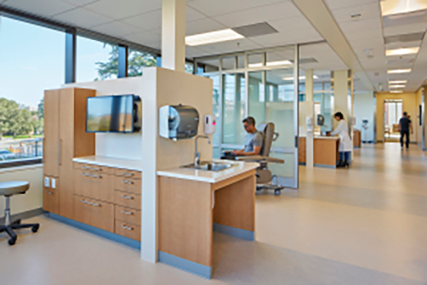
For example, the council influenced the choice of wall colors, which are subdued to increase comfort for patients with light or color sensitivities. The use of patterns and changes in floor texture are minimized for the same reason. Having the centralized reception and check-in area for all services was important because it means those with difficulty walking do not have to travel from place to place for multiple appointments. The check-in desk is the right height for patients in wheelchairs.
Constraints are an architect’s friend, whether the project is a historic treasure that has to be adapted respectfully or a brand-new structure for a brand-new use. Everything, from context and climate to program needs and legal requirements, gives the design team opportunities to be creative. While not every building has to contend with as many constraints of the Hoover Pavilion renovation or the Stanford Neuroscience Health Center, every piece of architecture emerges from a collaboration—a dance, if you will—between design vision and external constraints. Proper choreography makes for a satisfying result.