(This story is the seventh in a series to celebrate the 20-year anniversary of TEF Design. Check our blog for newly published, stories about our firm’s people, our community, and what drives us to design. Sign up — in the right corner above — to receive those updates in your inbox.)
In 2001, just before I joined the firm, TEF won the commission to design the South Beach Harbor Building. It was a big deal for the firm: our first freestanding building. As part of the San Francisco Redevelopment Agency’s revitalization of Pier 40, the goal was to create a new park for the public, enhance access to the waterfront, and replace the existing Harbor Master Building, then housed in a small trailer on the site. The landscape architecture firm EDAW (now part of AECOM) led the project, with TEF as consulting architect.
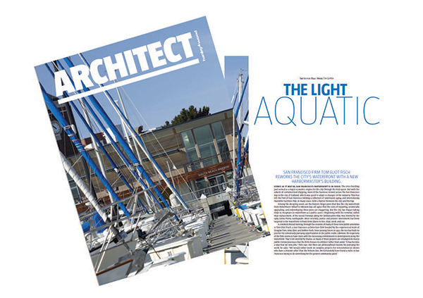
Published in Architect, the project was a milestone for the firm
Although the South Beach Harbor Building is a tiny structure, only 12,000 square feet, it is possibly one of the most complicated projects I’ve ever worked on — and I’ve worked on some really complicated projects. For one thing, although it is definitely an urban building, there was no real context to draw on. The Giant’s ballpark on one side offered nothing. To the east, long piers stretch out into the water. The buildings along the Embarcadero are hundreds of feet away. There was a small ILW building nearby, but it was a plain concrete tilt-up building, with no distinguishing features. We wanted to design something contextual, but what could we respond to?
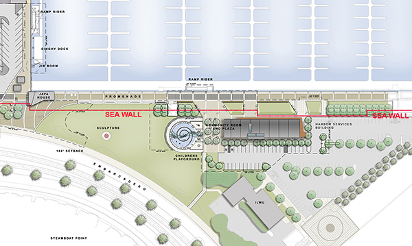
Site plan depicting location of seawall
The other challenge was more technical in nature. This part of the city is all on fill, held up by the seawall. On the waterside of the seawall is a marginal wharf, an old structure of concrete and wood piers. If we had put the building on that side, the costs to reinforce the marginal wharf to meet the seismic codes would have been astronomical. So we had to put the building on the land side of the seawall. Just finding records to determine the seawall’s location took some time. And we were still building on fill, so even though the structure itself would only be about 30 feet high, it would have to sit on 40-foot-tall piles. As a result, we spent probably more than half of our budget before we even began designing the building.
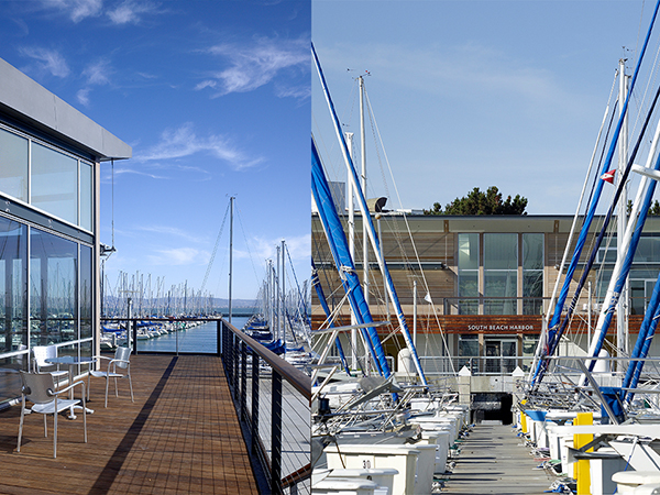
The dense overlay of back and forestays, masts and halyards of marina boats lined up in their slips inspired the building's language
Because the building had to be placed so far away from the Embarcadero and any public circulation, we had to give it a real presence as seen from a distance. Our client agreed with us that the building should be modern, and we wanted to make sure it read as a maritime building. Yet we wanted to avoid something as obvious as porthole windows. After some design exploration and research, we found ourselves interested in subtly referencing the shape of boats, the cables and masts, and the way that boats are constructed with exposed hardware. That became the inspiration.
In addition, we wanted a building that responded to the community’s needs. We attended several meetings with the public, and they expressed a desire for a facility they could use for gatherings and meetings. So we added a 1,000-square-foot community room at the ground floor, which also contains restrooms with showers for boaters and the maintenance facility. The second floor holds the harbor master’s office and also includes space leased by the South Beach Yacht Club for its headquarters.
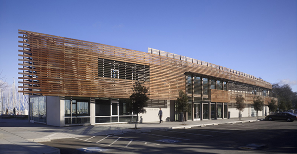
The west facade, with its solar orientation and need for a clear and iconic city-facing image, features a gently curved, wood screen wall lifted off the ground
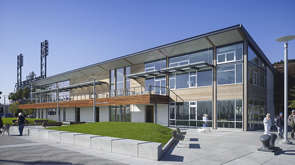
The eastern elevation maximizes views of the marina for both the harbormaster’s offices and the South Beach Yacht Club, which anchor opposite ends of the building
It’s a straightforward rectangular building, two stories tall, but we needed to develop the two long sides completely differently. We made the side facing the water much more open, as glazed as possible. The other side responds to the curvilinear geometry of the site and the gentle curve of the Embarcadero. We wanted to go with wood on this façade, and because the marine environment is so corrosive, we selected FSC-certified Brazilian Ipe, which holds up well and turns gray as it weathers. This wood is so hard that you can’t use nails—you put it together with screws. The roof is zinc, another highly durable material.
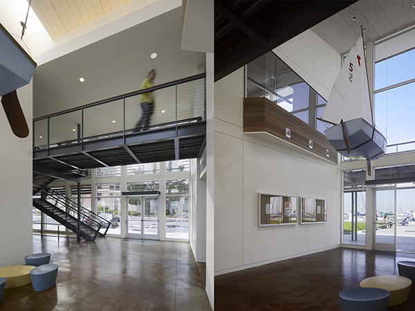
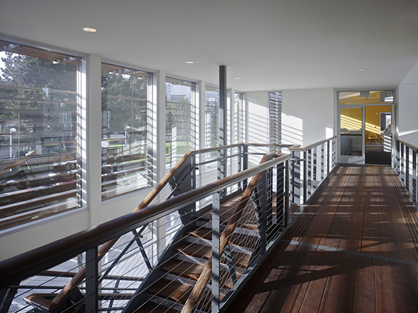
Interior details include a pedestrian "bridge" that cuts across the two-story lobby, a view corridor from land to sea
When it was completed in 2006, the building helped put the firm on the map, so to speak, in San Francisco. John King said some nice things about it in the San Francisco Chronicle and it got published in Architect. More importantly, the people who work there and the yacht club members have told us how much they enjoy it. And the EDAW-designed South Beach Park is a popular place for tourists, Giants fans, kids, dogs, and office workers alike, enlivened by a 60-foot-tall red steel sculpture by Mark di Suvero. It was great to have the chance to help make this corner of the waterfront find a new life.
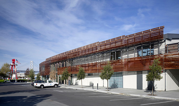
Northward view, with Suvero's nearby sculpture and the Bay Bridge beyond