(This story is the eighth in a series to celebrate the 20-year anniversary of TEF Design. Check our blog for newly published, stories about our firm’s people, our community, and what drives us to design. Sign up — in the right corner above — to receive those updates in your inbox.)
It was 1999. I had just moved to San Francisco and was looking for work. In my downtime, I rode my bike around the city to get to know it better. One day I rode down to the Ferry Building, and I thought, “This is so weird. Why is this amazing building practically vacant?” It was so cut off from the waterfront. I thought, “Somebody’s got to do something about it.”
Then about two weeks later, I got a call from SMWM: they were looking for a project architect for the Ferry Building renovation. Perfect timing! Nineteen years later, I’m still working on it—first at SMWM, then with Perkins + Will, now at TEF since 2014. It’s been an incredible journey.
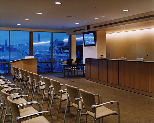
The Port Commission Room on the second floor
Coincidentally, one of TEF’s very first jobs—back when it was known as Tom, Bloszies, Aguila—was doing as-built drawings for SMWM early in the Ferry Building rehab project. Later, as Tom Eliot Fisch, the firm designed the Port Commission Room on the second floor. And Alyosha Verzhbinsky also worked on the Ferry Building during his time at SMWM, before joining TEF in 2001. So maybe it’s not surprising that I ended up here to carry on the work.
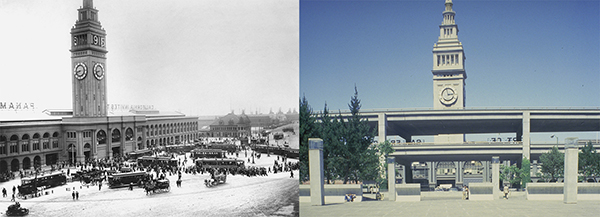
Historic photo, 1849 - 1909 Circa 1970, blocked by the Embarcadero Freeway
The Ferry Building really needed to come back to life: the elevated freeway that had long isolated it from the rest of the city had finally been knocked down in 1991. The rehabilitation project needed to make the building accessible to the public again and reconnect it to the Embarcadero.
Before starting, the developers and architects went on a tour to look at other examples of great marketplaces, like Pike Place Market in Seattle and the Granville Island Public Market in Vancouver. Some members of the team toured examples in Europe. (Alas, I didn’t get to go on that trip.)
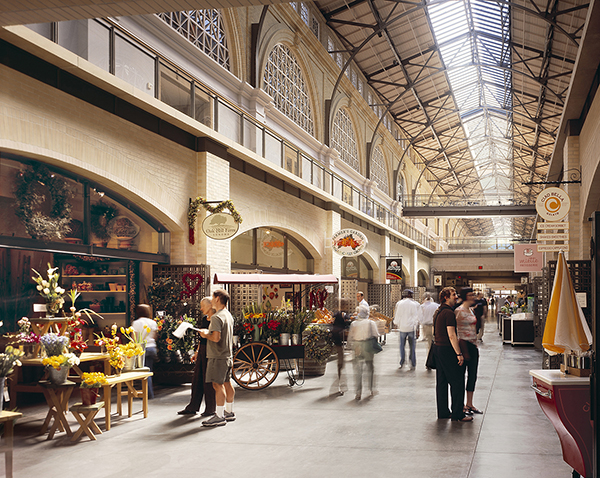
The "urban street" concept
Our initial idea was that we would revamp the Ferry Building to make it highly porous: the arcade would open up into the main floor, and you would be able to enter the building from almost anywhere. The shops would look more like free-standing pavilions. But in the end, we decided instead to go with the concept of an urban street with two sides, because we felt that would be more lively.
There were some challenges along the way. As originally constructed, the Ferry Building’s main floor was the second level, dubbed the Great Nave: a beautiful skylit concourse. Our goal was to make the retail viable and connect it to the Embarcadero, so that meant putting it on the first level. The developer, Chris Meany, had the idea of removing the second floor almost entirely to open up the ground level to the nave. But the National Park Service, whose approval we needed to get the historic tax credits, wanted to maintain the second level’s marble mosaic floor. At first they wouldn’t budge.
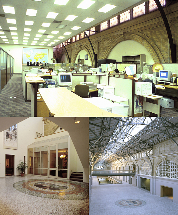
Third floor (top) and controversial second floor mosaics, both prior to (left) and after renovation
However, the second floor had already been filled in over the intervening years, and some of the mosaic floor had already been removed. There was a really tricky negotiation. Eventually it was agreed that we would cut two large holes in the floor, leaving the rest of it intact. That would allow daylight from the skylights to reach the ground floor, and it would also mean the second level could be used for event space. We were able to put most of the mosaics elsewhere on the second level, in places where they had been removed in previous renovations. The rest are in storage.
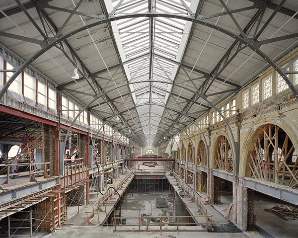
One of two large "holes" cut into the second floor
The developers spent a lot of time working on the retail mix, which was also challenging, because they were looking for small, local retailers, a lot of whom had never had shops before. The retailers they approached were wary at first. They had spent years cultivating their craft and their brand. Nobody wanted to sign first without knowing who else would be there. If you made artisan cheese, you didn’t want to share a space with a low-quality bread shop. And this was not that long after September 11 and the dot-com crash and everything. I think they signed Cowgirl Creamery and Acme Bread at about the same time. Peet’s was one of the early tenants to sign up, too. They had a strong reputation. Once we had great cheese, bread, and coffee, everything else was a lot easier.
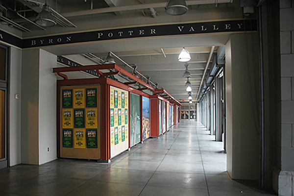
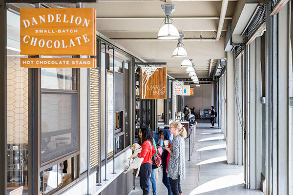
North arcade, before (top) and after renovation
All retail centers need fine-tuning, and the Ferry Building is no exception. Recently, we created the new retail kiosks at the north arcade, which will be likely be replicated at the south arcade someday. We’re adding some little infill kiosks inside as well. We’re helping fine-tune the space leased by the Prather Ranch Meat Company, which is finding that the meat case is a lesser priority these days—people are into buying prepared foods. Since the Ferry Building opening, we’ve seen a definite shift in the culture. Consumers are less interested in buying raw ingredients and cooking themselves, and more interested in dining out or getting takeout.
We’re also making improvements to common area facilities, helping the developers lease out upper floors, designing interiors of some of the office tenants, and working to enhance the public spaces on the main floor.
Another big project is to repaint the Ferry Building. It’s clad in Colusa sandstone, originally left exposed. Then it was painted at some point after the 1906 earthquake, probably to conceal the patching required to repair damage. For the 2003 reopening, it was painted a greenish tan color that was intended to be similar to the sandstone’s hue, but over the years that has faded to blue. So we’re working to come up with a new palette that will be even closer to the original Colusa sandstone.
My hope is that one day, it will be possible to reinvent the plaza in front of the Ferry Building. The way the Embarcadero is split leaves a gigantic space between the Ferry Building and the financial district. It takes forever to cross the streets there, and it can feel a little sparse on days when the Ferry Plaza Farmer's Market isn’t in session. Perhaps it could be rethought as part of Port of San Francisco’s upcoming Sea Wall Resiliency Project. In the 1920s, the Embarcadero was placed underneath that plaza, and it would be great if that could happen again, stitching the Ferry Building back into the heart of the city even more closely.