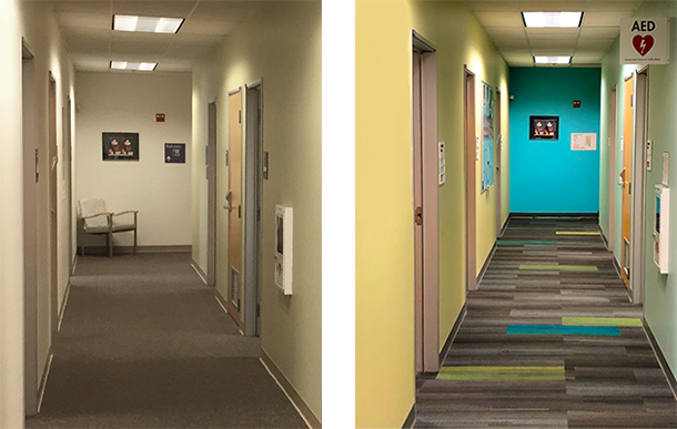
Before (left) and after (right) new paint and carpeting at a Hearing Aid Clinic
Big, brand-new health care facility projects tend to get all the press. And they should—it’s no small feat to construct a new hospital tower or medical office building in this era of rapidly changing technologies and care methodologies. But small interventions in existing health care campuses matter too. They are an essential part of our approach to providing comprehensive and continuous value to key clients and they can go a long way toward improving the experience of patients and staff alike. Although they may be modest, they have their own unique complexities and challenges to navigate.
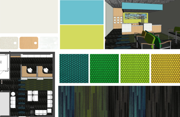
I’ve been working on two small projects within the main hospital at a South San Francisco medical campus. One is a space plan fit and the other is giving the emergency department waiting room and restrooms a bit of a facelift.
For the emergency department project, we needed to bring several options to our client. As an added wrinkle, another design firm was working on other aspects of the hospital at the same time, so we wanted to coordinate our work with what they were doing. Our options also had to fit with the campus materials palette developed a couple of years ago by yet another firm. All this while making the space feel fresh and new.
When we received a copy of the campus palette, we found it helpful in terms of design language, but unfortunately, all the products in it had either been discontinued or no longer met our client’s interior building finish standards. So we developed different solutions that still fit within the language of the existing campus palette (soft colors with punches of saturated accent colors and organic/geometric patterns).
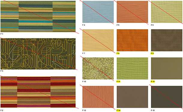
Obsolete material standards (above) provide precedent for an updated palette (below)
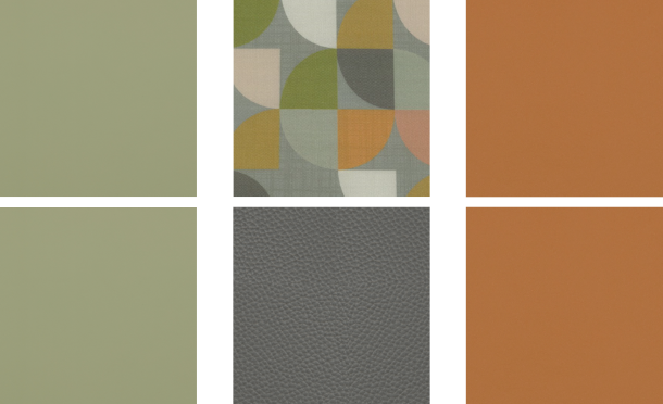
This isn’t unusual in health care assignments: we often have to present options with the understanding that they won’t match the existing finishes, because the old ones aren’t available any longer. In this particular case, it was easier, because the existing palette had a fairly contemporary feel. The client chose a palette with cool underlying colors to balance the warm faux wood flooring, with punches of sherbet green and orange (to connect with other spaces within the facility).
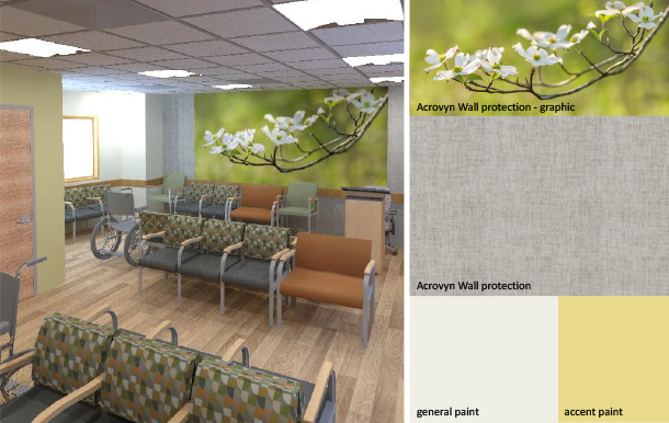
The refresh of an emergency department lobby leverages the contemporary language of an obsolete palette and makes it relevant for current and future needs.
Additionally, we proposed the use of impact-resistant wall panels, in part, to minimize long term wear and tear. More importantly, however, the panels provide textural and graphic imagery which will help promote a sense of peace and calm for patients and their families, who may be dealing with a stressful situation.
When we craft a small-scale design intervention at a health care facility, we try to avoid solutions that are too trendy. What’s fashionable often looks great for a year, maybe two, but quickly grows dated. Maintenance matters too. It doesn’t make sense to introduce a brand new type of flooring into a small area if it requires a completely different type of maintenance from the flooring in the surrounding area. We also strive to integrate materials that are friendly to the environment, avoiding vinyl flooring, for example.
Sometimes, continuity with the surrounding spaces is crucial. Other times, however, pushing the envelope to make a place dynamic is called for. I recently completed a redesign for a hearing aid clinic in Redwood City. The client is building a new medical office building on this campus, and the clinic will be moving into it in about four years, but for now, it’s remaining in space that the client has been leasing from another entity. Because this won’t be the long-term home for the clinic, and the clinic doesn’t have to coexist with other facilities immediately adjacent, there was more room for distinction.
A temporary refresh led to a more adventurous palette at the client's Redwood City location
I showed my clients three options for color palettes. The one they chose included citrus green and turquoise, very rich jewel tones with lots of energy, and a dark grey, black base. I selected a graphic for the back wall that depicted the inside of an abalone shell. It had swirling shapes that reminded me of an ear, rendered in the jewel tones they’d chosen. One administrator initially expressed concern that the pattern might be too “loud” for their clientele, who were predominantly elderly. I explained the importance of punching up colors for an older population, because as our eyes age, they don’t differentiate colors as well as they used to.

An anthropomorphic abalone shell detail – which echoes the jewel tones of the finish palette – provides an abstract focal point for the space
The manager of the hearing aid clinic loved the graphic. She said that one thing people forget is, yes, there are a lot of clients in their 70s or 80s, but a fair number of children and teens come in as well. If you’re a 14-year-old kid, you don’t want to walk into a place that looks like an assisted living facility. She felt that the graphic would be attractive to those kids and feel contemporary, and that the older population would appreciate it as well. So we put it in, and everybody’s happy with it.
Also in Redwood City, I worked on a project for a healthcare provider that occupies a building slated to be torn down. It involved refreshing a members’ services space, so small that there is barely enough room for several chairs. You enter through double doors and pass down a long hallway to reach the space. The old carpet was dated—and pink. This was the only space in the building where the public would be visiting, and because the building was targeted for teardown, it wasn’t economical to replace all the carpet in the hallway.
Rather than try to match the pink, we replaced it with a much more contemporary sage green and gray/blue color that led straight from the entry doors and into the renovated space. It was successful because it helped with wayfinding, delineating a clear and intuitive path for the public to follow—just walk on the new carpet.
When you refresh one area in a department, or a space in one department adjacent to another that’s not being updated yet, it can be challenging not to make the existing spaces look dirty, old, or antiquated by contrast. Perceived equity between the “haves” and “have nots” can also be a sensitive issue. That affects not just how patients feel, but also how staff feel. These decisions influence morale.
We advise our clients to communicate early to staff the reasons behind a project, as well as the constraints. And we try to give our clients language that they can use with staff: “We can only do so much at a time, but we know that this building is dated, and we are fully aware that your area needs attention as well.” Sometimes, once our clients have settled on an option, they will ask us to develop a finish board so they can show their staff the new finishes. Just presenting this to staff helps them feel like they’re part of the project, even if there isn’t an opportunity for input.
Small-scale design interventions may be modest in scale, but they don’t feel that way to the patients, visitors, and staff members who use those spaces. The right solutions, tailored to the specific context and timeline, can make a big, big difference.